Many of Designer Daily’s readers probably already know of Duolingo, an app that most of us install to try to learn a new language and give up after two weeks (in the best cases).
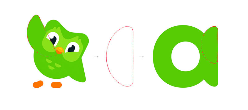
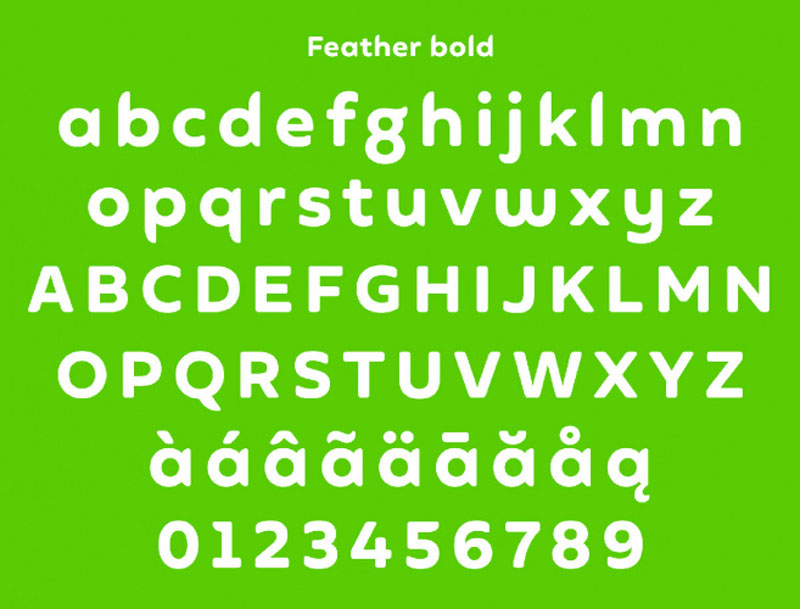
Recently, this very popular app underwent a rebranding that changed the face of its cute owl. Based on this illustration, a typeface was created to reinforce the look-and-feel of the visuals and unify communications of the brand.
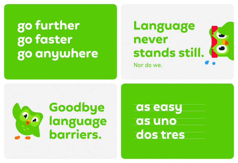
This work was done by Johnson Banks, a branding agency based in the UK. The agency also worked on the tone of voice used in communications and renewed the graphics based on the revised core colors.


![]()
Thanks for being a subscriber, here is your FREE house vector icons set..
